HSBC is not a real bank
From a customer’s perspective it’s hard to tell if HSBC UK is some sort of performance art as opposed to a real bank.
I will add more things to this blog post as they occur to me, since this is the first time I’m writing these down in one place some of the many many absurdities are bound to slip my mind.
How are they absurd? Let me count the ways.
You can only view about one month of transaction history in your account, and you see it in the logical reverse chronological order.
For anything older, you have to check your “statements”, which have overlapping data and are in chronological order. They have the data. They just refuse to show it to me in a useful form.
So if you want to inventory one month of expenses you now have to synchronize your recent transactions (reverse chronological) with one or two overlapping chronological ones. Oh, and multiply this by two to look at debit and credit card expenses.
If you thought the main banking website was bad (and it’s terrible. If you don’t think it’s absolutely awful then you’ve never seen e.g. SEB to compare), then you should see their InvestDirect+ and Investments sites.
They look like they were thrown together by a 10-year-old back in 1994. For InvestDirect+ the whole site is crammed into the upper left corner of a browser, and the first time I went there I honestly thought that the website was down. It looks like some CSS resources were unable to load, but it can’t even use that as as excuse, because all that loads.
Except for this gem (not a one-off):
<IMG height=1 src=„../images/spacer.gif„ alt="*" width=0 border=0>>
Those “bdquo” are not bugs in my blog. They’re on the HSBC website and they “403 Forbidden”. Somewhere there’s a logfile full of errors that HSBC is not looking at, that’s been logging errors since (I can only assume) the early stone age when this website was made.
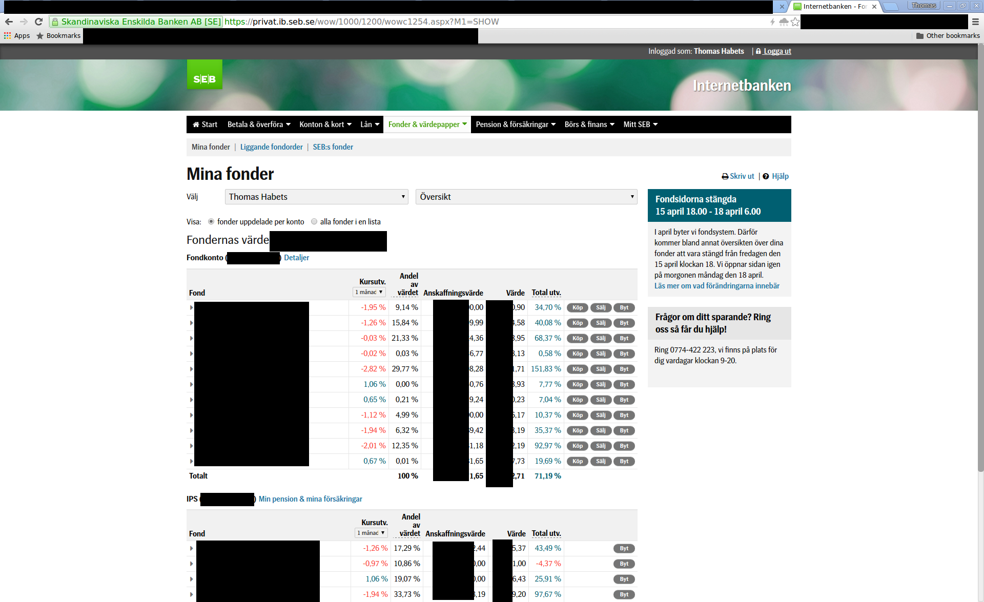
Compare these screenshots of HSBC InvestDirect and SEB:
(update 2018-01: SEB has since been updated to look even better, and has English translation on everything. HSBC is the same as before)
Their InvestDirect+ “contact us” page has not been updated in almost 10 years. It tells you to read a letter you received from them in 2006. Great. I joined the bank 5 years after that, and they probably have customers who were not yet born then.
You can’t put a limit order lasting more than the trading day online, you have to CALL THEM to do that. CALL THEM. With a PHONE. I guess I should be glad that I don’t have to send them a fax.
When you put in a sell order, you can’t see how many shares you have. You can only see that on a different page.
You have to manually transfer money into InvestDirect+ to buy shares, it can’t pull from your normal account.
You have to manually transfer back too. And it doesn’t remember any accounts, so you have to type in your sort code and bank account every time.
This website is obviously more than 10 years old, and they’ve still not integrated it into the main banking website. It still pops up a dedicated window, as if this were 1998.
I’m not even exaggerating when I say that online banking in Sweden is about 20 years ahead of the UK. Actually, it’s more true to say that UK banking is about 20 years behind. This has not been OK since the mid 90’s.
There are no banking reasons that could excuse this. I realise that banking is hard, but that can’t excuse why the hell you even create a 1x1 px “spacer.gif” for layout reasons. That spacer is there all over the code. I only found it because I wanted to see if there were CSS errors that could excuse the look. I was trying to give them the benefit of doubt.
There is nothing about this website that’s excusable. The people responsible should be fired, from a canon, into the sun.

